


MacOS 27 Golden Gate will usher in a bunch of changes to the Mac when it’s released later this year, with its biggest new features revolving around Siri AI. But for now, using the first developer beta, Siri AI is only offered through a waitlist. So what’s available to try is mostly about how the upcoming operating system looks and feels.
You’re not welcomed with any fanfare when you boot up the macOS 27 developer beta (that’ll probably come later), but there’s reason to celebrate. Jump to the appearance settings, and you find that Apple now has a Liquid Glass slider, allowing users to set the amount of UI transparency in macOS. On one end of the slider, it’s as seethrough as Liquid Glass gets, and on the other end the transparent accents are heavily frosted. Golden Gate starts you in the middle of the slider by default, for just a touch of frosting — perhaps a gentle admission that the original look went too far. You sadly can’t go fully opaque, but this frosted look does greatly reduce the distracting elements of Liquid Glass.
After spending just a short while with Golden Gate, I already prefer the minimum transparency look. I’d crank that slider in the full version and never turn back. For the strongest Liquid Glass haters out there, the Reduce Transparency option is still available in the Accessibility settings, but using it is like taking a hammer to all that glass — introducing lots of harsh gray and black backgrounds to the dock, Menu Bar, and Control Center.
The absolute wins for macOS 27’s design is the return of edge-to-edge sidebars with colorful icons and the increased corner radii of windows across the OS. The former is basically a backtrack to the way sidebars used to look (which looked better and easier to parse, with less wasted space). And the latter is just logical. How on Earth did Apple get so high on its own design supply that it allowed windowed apps to have mismatched corners?
I do have my nitpicks — the new battery icon taken from iOS is less legible (really, I hate it). Also, after Apple finally added the most basic window snapping feature in Sequoia, it hasn’t refined it one bit. Both Tahoe and now Golden Gate are leaving me wanting better and faster tiling controls like Windows 11, as well as the simple ability to rename virtual desktops. But so far, nothing.
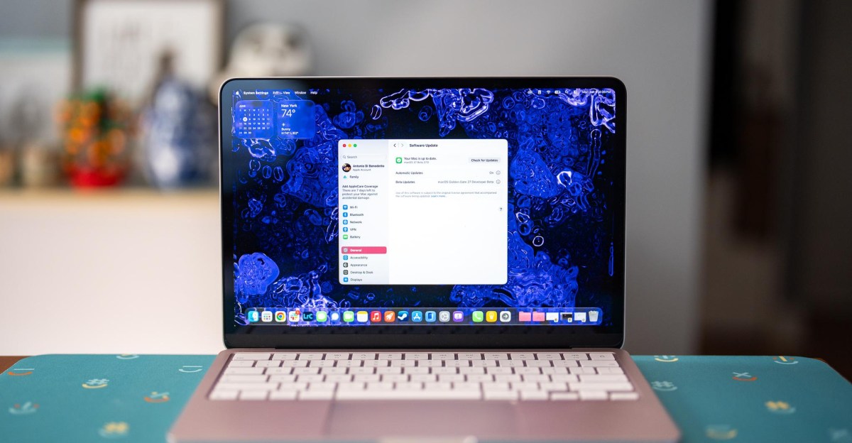
Apple says Golden Gate is supposed to feel snappier, with faster search indexing. It’s too early to tell how much of a difference this makes on the MacBook Neo I’m testing it on — especially since dev betas are notoriously buggy and unstable. Using Spotlight search for local files on Golden Gate performed similar to another Neo I had on-hand running macOS 26 Tahoe. And opening apps on both systems side-by-side led to mixed results: Golden Gate opened Lightroom Classic and Slack faster, but Tahoe was faster to open Photoshop and Steam. I hope Apple’s under the hood improvements to memory and CPU usage will really show on the MacBook Neo, which could use all the efficiency it can get, but the jury’s out for now.
There’s still more to come with further beta releases of macOS 27, where we’ll at some point be able to fully test Siri AI, Visual Intelligence, and the revamped Spotlight Search. Last year’s power user-focused Spotlight with clipboard history was a nice improvement, but I’m skeptical that Siri AI being baked into Spotlight will be quite the gamechanger Apple’s billing it as. I’ll keep an open mind and be looking to find out once I’m off the waitlist.
For now, I’m relieved Apple is slightly backpedaling on Liquid Glass. While the look was never quite as bad on the Mac as it was on iOS, it’s a welcome change to be able to turn down these transparencies and get a little closer to the old looks from Sequoia. That and the other bits of UI polish are a nice upgrade on their own. Now, Apple has to show that it can nail all the new AI features, too — I’m eager to see how it fares.
Read the full article here


