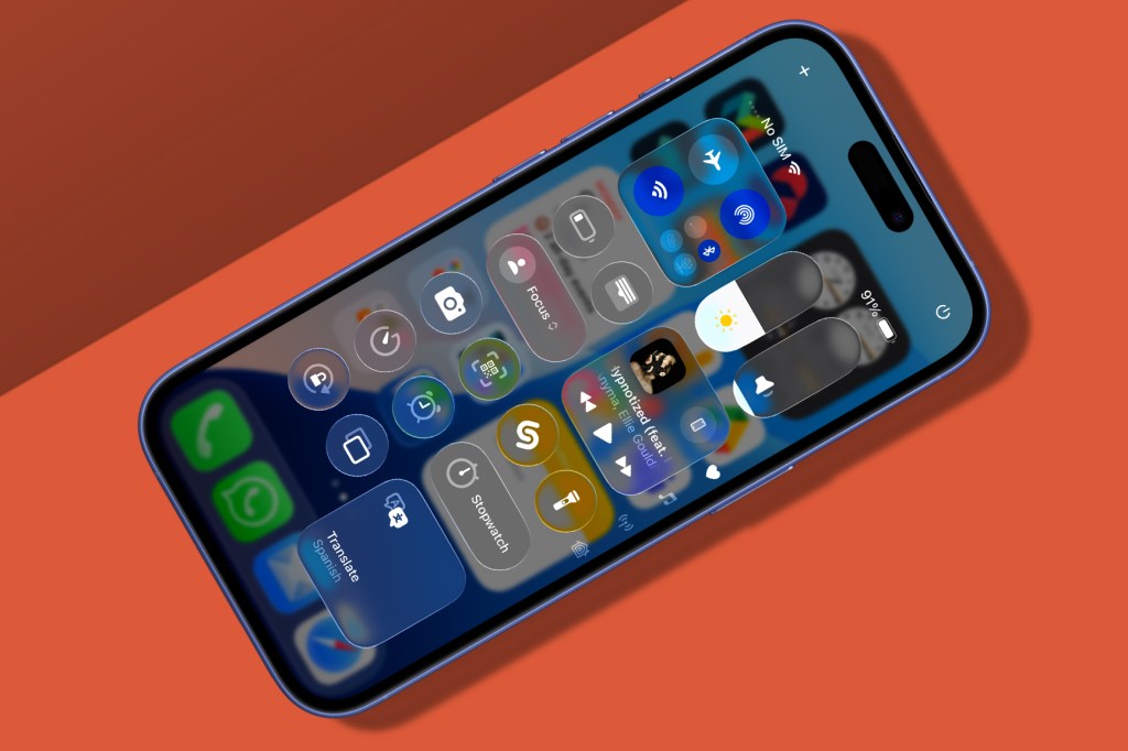
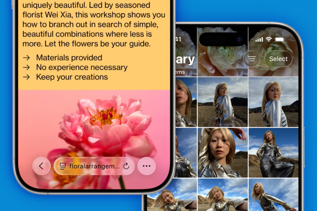
As Apple’s WWDC25 keynote dragged on for what felt like its customary 37 hours, it quickly dawned on me that this year’s epic was all about one thing: glass. But not just any glass: Liquid Glass! Apple has decided the future is see-through. And not just for its $3500 face computers either.
This time every iPhone, iPad, Mac, Apple Watch and Apple TV is getting a dose of visionOS. I almost want to congratulate Apple on its ‘bravery’ in pushing a unified design language across its entire product line, inspired by what’s effectively a failed platform. Except I don’t, because Liquid Glass has problems.
Apple’s interfaces now look like they’re auditioning to cameo in Minority Report or The Avengers. You know the look: transparent displays with see-through elements sliding around. All very futuristic, until you actually use one.
Of course, in the movies, glass makes practical sense, because you can see the stars, even if the camera is behind the screen. The goal is to see Tom Cruise’s mug, not for Tom Cruise to read his to-do list. In the real world, however, there are – for good reason – distinctly few interfaces comprising sheets of overlapping glass.
Still, Apple went to extraordinary lengths to convince everyone (including, I suspect, itself) that Liquid Glass was the new black. There was endless talk of dynamic animations and reflected light. In one memorable moment, we were shown tvOS and told how “playback controls refract the content underneath, beautifully complementing the action without distracting from the story”. Because nothing says ‘not distracting’ like James Bond’s face reflected in a pause button.
At this point, I can only imagine a solitary voice rang out from deep inside Microsoft HQ. A survivor of the Windows Vista wars, screaming “VINDICATION!” shortly before being silenced forever by a redeployed Terminator Clippy. “You look like you’re trying to justify terrible design decisions, circa 2007. Can I help you… stop?”

Pain in the glass
The hits kept coming. Buttons and tabs now show backgrounds through them, which is great if you never actually want to read their text. Scrolling content now visibly flows beneath macOS sidebars. And all this is topped off with other ‘unobtrusive’ design choices like eradicating the macOS menu bar background and, wherever possible, hiding interface elements entirely.
Except for Dynamic Island on iPhone, which is now a massive wodge of black that’s surrounded by a sea of glass. Perhaps Apple will fix that in September with an all-new iPhone that hides the selfie camera beneath the display, or just bins it entirely. After all, who needs practicality when you have Liquid Glass? Certainly not Apple.
But maybe this is all just OLD MAN CRAIG grumping again. Interfaces change. Styles shift. And let’s be honest, Apple’s latest design shouldn’t come as a great surprise anyway – legibility hasn’t topped its priority list for years. We’ve had grey text on grey backgrounds, the eradication of colour from toolbar and sidebar icons, and more. Glass is just the next step. Just as well, then, that Apple’s operating systems include a raft of accessibility settings, because I’m going to need them.
Or maybe this is all just a cunning ploy to force everyone to use Apple Intelligence – because you won’t be able to read anything on your iPhone this autumn. Perhaps Jony Ive is secretly back at Apple and won’t rest until every device is a faceless, translucent slab you can only interact with by talking to it.
Although, given the paucity of new Siri features announced at WWDC25, that would be an even ‘braver’ decision by Apple than making everything look like it had fallen out of an abandoned Apple Vision Pro.
Read the full article here
