
Apple’s macOS Tahoe 26 public beta is finally available, and with it the same Liquid Glass design language that’s coming to the rest of Apple’s operating systems. It’s a simultaneously weird yet milquetoast update. I’ve been testing the developer beta on an M4 MacBook Air since WWDC in June, and after using it through to the latest dev beta release (which is similar to the public one), I’ve had some ups and downs. But, frankly, it’s mostly been a lot of “meh.”
My first 24 hours with the first Tahoe developer beta left me baffled by Liquid Glass (with Windows Vista comparisons abounding), but I conceded that the design might grow on me. Instead, I’ve grown to mostly ignore it. The translucency has been ever-so-slightly toned down to a frosted look (though Apple’s tweaks continue). I do think it’s slightly improved over the first dev beta, but not as good as the outgoing macOS Sequoia.
1/15
I bet most people, whether trying the public beta for Tahoe or waiting on the full release in the fall, will upgrade and think, “This is fine.” And they won’t be wrong. But Sequoia’s flatter, simpler design felt cleaner and more purposeful — and every time I see or use a Mac that’s not on the beta I want to go back. Liquid Glass feels desperate, like Apple was fishing for ways to freshen things up for the sake of doing something different. Hey, everybody, look at the shiny new UI! No, don’t pay attention to how underwhelming Apple Intelligence still feels, despite the endless overselling in TV ads.
The major advantage of a Mac is that here the Liquid Glass-ification feels less obtrusive since there’s so much more room to breathe. I’m relieved Apple made Control Center more opaque since the unparseable initial take on the Control Center in the first dev beta, especially on the iPhone or iPad, where it’s inescapable. But I don’t care what they do with Control Center on the Mac, because I never use it.
Every time I see or use a Mac that’s not on the beta I want to go back
On a Mac, Control Center is just one of a few places you can access settings like Bluetooth, Wi-Fi, screen brightness, and audio volume. That’s the beauty of a desktop operating system; you have tons of options for doing things, including Apple’s odd iOS-ification of macOS starting in Big Sur, and you can use them how you like. And that includes dedicated keyboard keys for functions like media playback and brightness settings.
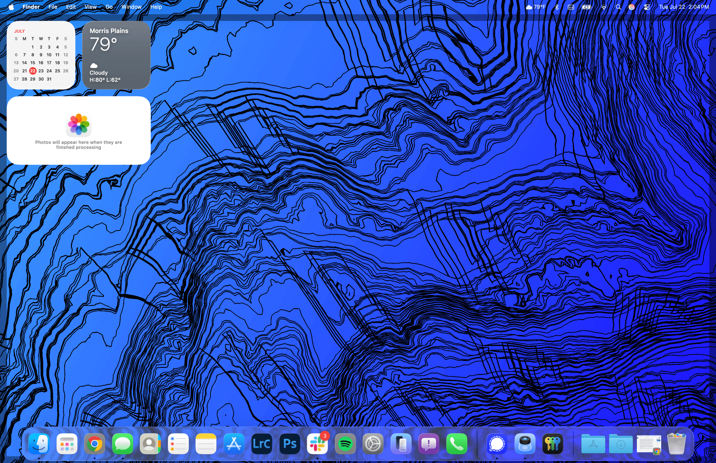
But even though Apple is improving Liquid Glass a little, it’s still making choices I find odd or out of place. The Menu Bar remains invisible by default, as in the first dev beta, but it can once again be given a background like the old way (and without resorting to killing all transparencies in the accessibility settings). However, when you use Show Desktop and clear all your windows to the side (either with a four-finger trackpad swipe or by clicking the wallpaper), the Menu Bar has a shadow-like outline beneath it, even with the Menu Bar fully transparent. It’s functional, to show the borders of the desktop while your windows are temporarily hidden, but it’s weird for something invisible to look like it’s casting a shadow.
1/2
The popup in the top right corner showing when you adjust volume or brightness via the keyboard still feels too high up and disconnected from your physical input. It doesn’t look quite as ugly as it did on the first dev beta, but the old, center-aligned popup near the bottom of the screen always felt nicely anchored (it’s also how macOS worked for as far back as I remember using it).
I hope Apple continues to tweak and refine Liquid Glass, but for now I’m just letting its mediocrity wash over me. I barely pay attention to it now. It’s glass, after all; something in real life designed to be invisible and inoffensive — something to look beyond.
The parts of macOS Tahoe that I find most useful and important are the updates to Spotlight and the inclusion of a fully baked Phone app via your iPhone. The latter is quite simple: the dedicated Phone app allows you to take and make calls on your Mac without having to touch your phone. In the past you could field an incoming call on your Mac, but now you get a full app that works just like it does on iOS, complete with the ability to listen to voicemail and dial numbers via your keyboard if you’re inclined (and actually have phone numbers memorized). It’s helped me be slightly less procrastination-prone in calling doctors’ offices, contractors, and other businesses while not fully detaching myself from my work. Normally, I’d push those essential calls off, and then next thing you know it’s well past 5PM and they’re closed for the day.
The Spotlight updates are best for the Shortcuts sickos. And, candidly, that ain’t me. On a PC, I frequently use the Windows key to search and open apps, but on Macs I’ve never used Spotlight that much. But the new features in Tahoe are getting me to dabble. I appreciate the clipboard history most. I’m slowly building muscle memory for the Command + Space and Command + 4 sequence, which calls up the clipboard history. I’ve read that Raycast is more fully featured than Tahoe’s Spotlight; e.g., Spotlight’s clipboard history only shows things you copied in the last eight hours, where Raycast’s history can span up to three months or indefinitely if you pin them.
1/4
I know Raycast and other dedicated application launchers can do more detailed and intricate tasks, but the improved Spotlight and clipboard are good enough for me — for now, at least. I imagine Apple may slowly flesh out these features over time, and that might be a healthy on-ramp for the power user-curious. I’d like the clipboard history to get a touch more robust by the time of Tahoe’s full release in the fall. However, Apple is likely to not be as freewheeling as an app like Raycast, since one person’s expansive clipboard history is another person’s privacy nightmare — likely the reason for the eight-hour time limit.
Now that the public beta is out, many more people will be able to try out Tahoe and see what they think of Liquid Glass. Thankfully, outright performance seems normal now, after battery life took an initial nosedive in the first dev betas. But anyone interested in dabbling should be aware that there are bound to be bugs in a beta — especially with third-party apps. I’ve noticed Signal and some Adobe apps acting up when displaying lots of white, temporarily looking like washed-out gray (though it’s not visible in saved files or screenshots, and some Lightroom Classic tools like cropping and the auto white balance eyedropper work fine but don’t always get picked up by your cursor).
If you rely on a single Mac for your everyday work, I’d wait until the full release in the fall to get your first taste of Liquid Glass. A fresh design for a major operating system can feel invigorating, but for Macs and Tahoe it’s a snoozefest for now.
Read the full article here