


When the next version of iOS lands on your iPhone this July, it’ll look wildly different from what you’re used to. Apple has given its smartphone interface a liquid glass overhaul – and is bringing the iPad, Mac, Apple Watch and Apple TV along for the ride. Your homescreen, control centre, app icons and apps themselves will all see changes.
Here’s what to expect from the unified design – and what you can do to dial it down if you’re not a fan of translucent effects.
What is liquid glass?
Apple’s new look, revealed at WWDC 2025, basically takes the semi-seethrough interface that debuted on its Vision Pro headset and slathers it all over the rest of its device line-up. The menus and other UI elements you’re used to have also been simplified or rearranged to match.
Glass-like icons and menus make sense on an augmented reality headset; you’ve got to be able to see what’s around you to avoid bumping into things. That reasoning doesn’t fly on your phone, tablet, laptop, watch or TV screen, but having one unified look certainly ties Apple’s ecosystem together.
Liquid Glass will arrive officially with iOS 26, iPadOS 26, WatchOS 26, tvOS 26 and MacOS 26 Tahoe.
Anyone with a modern-ish Apple device and a developer account (which used to cost $99 but is now effectively free to sign up for) can try out the new software early, by installing developer beta 1. Be warned, though; there are lots of bugs – arguably more than any iOS dev beta in recent memory – so maybe only consider it if you have more than one iPhone.
Liquid glass on iOS 26
After installing iOS 26 developer beta 1, you’re met with a liquid glass version of the familiar iOS lock screen, and a glass numerical keypad for tapping in your PIN (if you use one). The homescreen looks largely familiar, because app icons keep the standard colour scheme by default – but everything has been given a more glass-like appearance.
Apple has also added a new Clear icon option, which makes every app looked etched into glass. Unless you’ve got a very pared-back homescreen, or have memorised where your apps live, it feels a lot harder to find something specific at a quick glance.
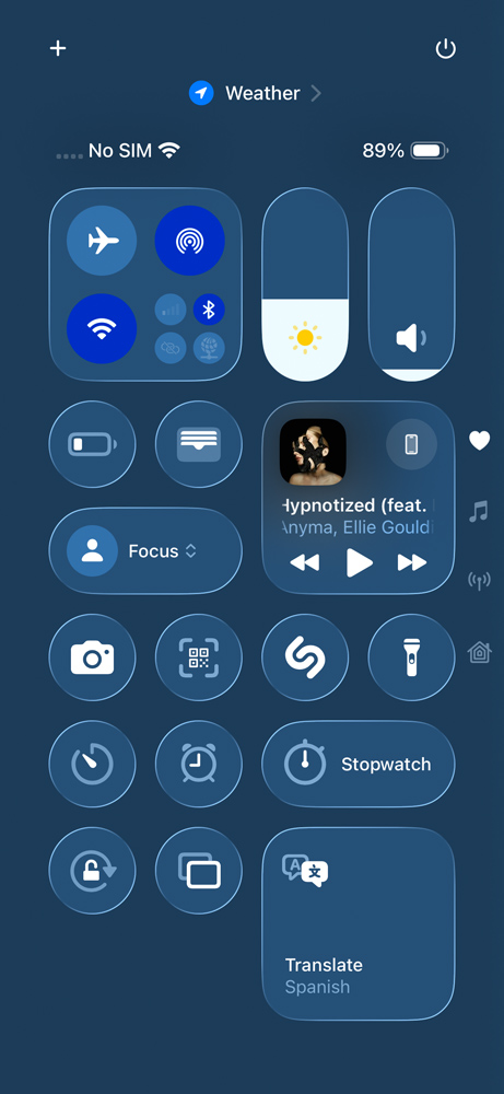
A lot of UI elements that used to be opaque are now transparent. App folders diffract your phone’s wallpaper as you swipe between homescreens, while menus and text entry fields have a frosted effect that shows off whatever is directly beneath them. You can’t miss it on the control centre, which at this early stage looks seriously cluttered and distracting.
The Safari URL bar now shrinks right down while you’re scrolling down, reappearing when you tap it or scroll up to sit on top of whatever web page you’ve got open. The back and menu buttons add more diffraction effects. Other apps like Mail, Phone, Messages and Clock have seen similar tweaks. Apple Music and Photos have simplified menus now too.
About the only thing that hasn’t been given a liquid glass makeover is dynamic island – because doing so would ruin its ability to disguise the selfie camera cutout. I’m sure it’s a sign that Apple is hard at work on an under-display camera for an upcoming iPhone generation.
How to turn off liquid glass


Liquid glass looks here to stay, but unless Apple reduces the strength of the translucency effects between now and public release, there are going to be plenty of people who will hate how distracting and visually confusing the new interface has become.
Happily there’s one thing you can do (at least in the developer beta) to improve legibility across the board.
Head to the Settings app, then Accessibility, then Display & Text Size. Enable the toggle for “reduced transparency”. That’ll cut out most of the flashier animations, making the control centre in particular a lot more legible. It can’t bring back the old-style menus, though.
Read the full article here


