


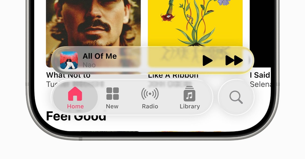
Apple’s new Liquid Glass design language just got a little more… frosted. In the third iOS 26 developer beta, Apple dialed back the transparency of navigation bars, buttons, and tabs that once allowed you to clearly see the content beneath them.
Apple already toned down the glassiness of Liquid Glass after many users complained that it was too transparent and made it more difficult to see certain options, like the icons inside the Control Center. This most recent beta makes Liquid Glass elements even more solid, likely as a way to improve readability. Still, some users see the change as a reversal of the flashy, glass-like design that Apple showcased at WWDC.
This is still just a developer beta, so it’s likely that Apple will continue to make tweaks before it releases iOS 26 to the public in September.
Read the full article here


