


Microsoft is officially unveiling its new Office icons today, after they leaked earlier this year. The icons have a modern design that’s more colorful and playful, with subtle changes that match Microsoft’s recent work with its Fluent illustrations.
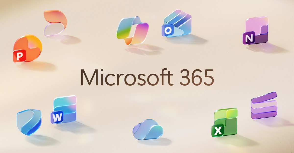
All of Microsoft’s 10 core Office icons are being refreshed, with a design that was inspired by Microsoft’s work on the Copilot icon. This is the first major change to the Office icons since their overhaul in 2018, and it’s meant to represent a more connected design system and Copilot’s influence on Microsoft 365.
“The core 10 Office apps were last updated in 2018 and the way we described what the designs represented is almost identical to language used today: connection, coherence, seamless collaboration, fluid transitions,” explains Jon Friedman, corporate vice president of design and research for Microsoft 365. “The new icons emanate a sense of fluidity and play, while also being simpler, more intuitive, and highly accessible.”
Much like Google’s new logo, Microsoft has picked gradients of color for its Office icons. “Where gradients were once subtle, they’re now richer and more vibrant, featuring exaggerated analogous transitions that improve contrast and accessibility,” Friedman says.
The new icons are also a little more simplified, with the Word icon previously using four horizontal bars and now using three, to improve legibility at smaller sizes. “We’ve moved away from bold, static solidity to embrace softer, more fluid forms,” Friedman explains. “Sharp edges and crisp lines are replaced by smooth folds and curves, giving the icons a sense of playful motion and approachability.”
The new icons will start rolling out in the coming weeks across web, desktop, and mobile for both consumers and commercial users of Microsoft 365.
Read the full article here


